
GET IN TOUCH
Ask For Sample?
How Custom Packaging Helps Differentiate Your Pool Clarifier Brand?
A customer stands in front of a shelf of pool care products. Several bottles promise clearer water. Most use blue graphics. A few carry bold claims. Prices vary, but the differences aren’t easy to spot.
Why should that customer choose yours?
Your formula matters, of course. Yet buyers can’t judge a polymer’s performance through a sealed bottle. They first see the package, read the label, and decide whether the product seems right for their needs.
That makes custom packaging a useful part of your pool clarifier brand strategy.
A well-designed package can help customers recognize your brand, understand the product, and use it with greater confidence. For distributors and pool service companies, it can also make stock handling and repeat ordering easier.
The strongest packaging does several jobs at once. It attracts attention, carries clear information, protects the contents, and fits the way people work.
Let’s look at how those details can help your pool clarifier stand out.
Your Package Starts the Conversation
Before a sales representative explains your product, the bottle has already said something.
A clean layout, readable product name, and well-fitted label suggest care. A crowded design with tiny instructions may leave customers unsure, even if the formula inside is well made.
Think of packaging as the first page of a conversation.
It should quickly answer three questions:
- What is this product?
- What is it meant to do?
- Is this the right format for me?
For a pool clarifier, “POOL CLARIFIER” should be easy to find. A brief description can then explain its role, such as helping filtration remove fine suspended particles.
Keep the promise focused. A customer should not need to study the back panel to discover whether the bottle contains a clarifier, an algaecide, or another treatment.
This clarity matters online, too. In a small product image, fine print disappears. A clear visual hierarchy helps your product remain recognizable when the bottle is only a few inches tall on a phone screen.
Start With the Buyer, Then Choose the Bottle
It’s tempting to begin with a bottle shape you like. A better starting point is the customer’s routine.
A homeowner may use a clarifier from time to time and store it on a small shelf. A service technician may carry several chemicals between jobs. A commercial operator may need larger quantities and a more structured dosing process.
Each buyer has a different idea of convenience.
For the homeowner, a manageable bottle and simple directions may carry the most value. For the technician, grip, pouring control, and clear product identification may matter more. For the distributor, carton strength and easy stock checks become part of the decision.
Ask a few practical questions before approving a container:
- Who will lift and pour it?
- How often will they use it?
- Where will they store it?
- How will they measure each dose?
- Will the product reach them through a shop, a service company, or parcel delivery?
The answers give your design a purpose. They also help prevent spending money on features that look impressive but add little value.
Make Your Brand Familiar at a Glance
Custom pool clarifier packaging helps create a visual identity that buyers can remember.
That identity may come from your logo, label layout, typeface, color palette, or bottle silhouette. You don’t need all of these to be unusual. You need them to work together.
For example, a brand might use a white container, a navy product name, and one distinct color band for each product category. The clarifier becomes part of a recognizable family while keeping its own place within the range.
Consistency is especially useful when customers reorder.
A pool service company may remember the label layout before it remembers the full product name. A shop employee may identify the right carton from a matching visual cue.
Still, color should support clear text. It should never be the only way to tell two chemicals apart.
Good brand recognition helps customers find the right product again. That is a more useful goal than making every new label look completely different.
Choose Pack Sizes That Fit Real Work
Pack size influences price, handling, storage, and the customer’s first purchase.
A smaller pack may make a new product easier to try. A larger pack may suit regular users who want fewer containers to handle. Neither is automatically the better choice.
For a pool clarifier range, the following formats can serve different needs:
| Packaging format | Potential customer fit | Main design priority |
|---|---|---|
| 1 L bottle | Homeowners and retail buyers | Clear directions and controlled pouring |
| 5 L jerrycan | Pool service teams and frequent users | Comfortable handling and secure closure |
| 25 L jerrycan | Higher-volume users | Suitable dispensing and storage arrangements |
These are starting points, not fixed rules. Product concentration, treatment frequency, and local buying habits should guide the final choice.
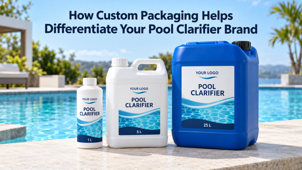
Eautrix lists 1 L bottles, 5 L jerrycans, and 25 L stackable jerrycans for its polymer pool clarifier, alongside private label support. This provides several formats to discuss when planning a branded range.
A focused launch may need only one or two sizes. Too many formats can tie up cash in slow-moving stock before you know what customers prefer.
A Useful Handle Can Say More Than a Fancy Finish
Packaging design becomes real when someone lifts the container.
Does the handle give enough room for a comfortable grip? Can the user control the pour? Does the cap open and close without an awkward struggle?
These details may seem small during a design meeting. They feel much larger when someone is carrying equipment on a hot afternoon.
For a larger clarifier pack, assess the filled container rather than judging an empty sample. Weight changes the experience. So does the shape of the handle and the position of the opening.
If the intended dose is small, pouring directly from a large jerrycan may be inconvenient. A suitable measuring or dispensing method may be needed.
The aim is to reduce friction in the customer’s routine.
A package that is easy to work with gives buyers a practical reason to remember your brand. It makes your product feel considered, which can support a premium position more credibly than decorative details alone.
Turn the Label Into a Helpful Guide
A label has limited space, so every line needs a job.
The front panel should identify the product and communicate its main purpose. The back or side panel should explain use, storage, and other required information in a readable order.
Avoid squeezing all the text into one dense block. Short sections, plain language, and visible spacing help readers find what they need.
Directions deserve special care.
The final label should make the dose basis clear. Does the stated amount refer to the finished product or its active polymer content? Which water-volume units apply? Are the instructions for routine maintenance or a different treatment situation?
Those points should be settled before the artwork reaches the printer.
Also, don’t copy directions from a similar-looking product. A different concentration or formulation may need different instructions.
Clear packaging cannot prevent every mistake. It can, however, remove avoidable confusion and give customer support teams a more reliable reference when questions arise.
Make Measuring Easier Without Encouraging Guesswork
A measuring cap can be useful. So can a separate graduated measure. But either feature needs to suit the product and the intended dose.
A cap that looks convenient may still be too large, too small, or difficult to read.
Check whether its markings are visible under normal working conditions. Confirm the capacity. Make sure the directions state whether to use a full cap or a marked level.
“One capful” sounds simple, but it becomes vague if the cap changes between packaging batches.
Where a separate measure is supplied, make its role clear. It should be dedicated to the chemical rather than treated like a general household cup.
There is also a design lesson here: convenience and precision should support each other.
A package should help customers follow the approved directions. It should not tempt them to pour an uncertain amount because the correct dose is hard to measure.
Use Color to Build Identity, Not to Suggest Strength
Blue is a familiar choice for pool care packaging. It can fit the setting well, but a shelf full of blue labels can become a blur.
Your brand needs more than a blue background.
You might use a distinctive arrangement of white space, a strong product name, or a consistent graphic pattern. These details can help establish identity without making the package busy.
Separate the color of the label from the color of the liquid, too.
If you consider a clear or blue-dyed clarifier, treat that as a formulation decision as well as a visual one. Any dye should be assessed for the intended product and use.
Avoid implying that a darker liquid is more concentrated or works better. Appearance alone does not prove treatment strength.
The package should make the product easy to recognize while keeping its claims tied to what the formulation can support.
Premium Packaging Should Earn Its Place
What makes a pool clarifier look premium?
It might be a clean label, crisp printing, a sturdy container, and a closure that feels secure. None of those requires an elaborate custom mold.
For many brands, quality comes through restraint.
A simple package with clear information can feel more professional than one covered in badges, claims, and glossy effects. The design gives the buyer space to understand the product.
Spend first on details customers can notice through use:
- A container suited to the formulation.
- A reliable cap and sealing arrangement.
- Readable, durable labels.
- Clear batch identification.
- Consistent filling and presentation.
A decorative finish may still be worthwhile. Just ask what it adds.
Will it help your target buyer recognize the brand? Does it hold up during handling? Does the price fit your market?
“Premium” works best when the package delivers a better experience, not just a higher packaging bill.
Protect the Label as Carefully as the Bottle
A label may look excellent on a dry desk and struggle in actual use.
Pool chemical packaging may encounter damp hands, splashes, friction, and changing storage conditions. The label material, adhesive, ink, and surface finish should be assessed together.
Ask your supplier for a finished sample using the proposed production materials.
Check whether the label edges lift. Look for smudging, bubbling, or loss of print. Confirm that important text remains readable after handling.
These checks should reflect intended use and storage. A package does not need to survive an invented extreme to be useful, but it does need to suit the conditions customers are likely to face.
Pay attention to the bottle surface as well. A label may behave differently on a curved, textured, or recessed panel.
The whole system matters. A good adhesive cannot fix a label shape that constantly catches at the corners.
The Carton Is Part of Your Brand Experience
Retail labels receive most of the design attention. Distributors often meet your product through the outer carton first.
That carton can make stock handling straightforward or frustrating.
Clear product names, pack counts, and item codes help warehouse staff identify the contents. Legible batch references help teams connect stock with the right records. Suitable carton strength helps protect the goods along the planned route.
Avoid making every shipping mark look like an advertisement. Functional information needs to remain easy to find.
If you sell several products in similar cartons, create a clear way to distinguish them. Use text and item codes alongside any color cues.
For parcel sales, assess the individual shipping arrangement separately. A carton designed for pallet movement may not suit single-order delivery.
Your customer sees the result of the full journey. A handsome bottle inside a damaged box sends mixed signals.
Keep Recognition Consistent Across Your Range
A pool clarifier may be one part of a wider pool maintenance line.
Shared design elements can help the range feel organized. Keep the logo position, typography, and general label structure consistent where practical. Then make each product’s identity clear through its name and supporting visual cues.
This helps distributors present the range as a family.
It can also help buyers navigate your website. When the product photographs share a consistent style, the catalog feels easier to follow.
However, consistency should leave room for clear distinctions.
Clarifier and other pool chemicals should not become so visually similar that a hurried user can confuse them. Large product names and readable directions matter more than perfect visual uniformity.
Think of the range like a well-organized toolbox: each item belongs to the same set, but people can still find the right one quickly.
Match the Package to the Market You Serve
A package that works well in one sales channel may need changes for another.
Retail buyers may benefit from a brief explanation of the product’s role. Professional customers may place more value on precise directions, product codes, and easy access to technical information.
Language and measurement units also deserve attention.
If buyers use liters and cubic meters, the directions should fit that context. Where other units are needed, verify the conversions carefully. A translated label should receive technical review as well as language review.
Leave room for market-specific information during the design stage.
Required label content should be checked for the destination market and product classification before printing. Building that space into the layout early is easier than shrinking every line at the last moment.
Customization is useful because it lets the package speak clearly to a defined audience.
Use QR Codes as Support, Not a Shortcut
A QR code can connect the physical product with useful digital content.
It might lead to a product page, a short application video, or a support form. That gives your team more room to explain the product without crowding the label.
Keep the destination focused. A customer scanning for directions should not land on a general homepage and search again.
Test the printed code on the actual container. Curves, reflections, small print size, and low contrast can make scanning difficult.
Essential instructions and required information should remain available on the package as applicable. Customers may have weak phone reception or no reason to scan.
The best QR code adds convenience. It doesn’t make basic use depend on a phone.
Test a Complete Sample Before Committing
A digital mockup is useful for checking layout. A physical sample reveals the parts a screen cannot show.
Review the filled package with the proposed cap, seal, label, and carton. Ideally, ask people who resemble your target users to handle it.
Give them simple tasks: identify the product, find the directions, measure an example dose using the intended method, and close the container.
Watch where they hesitate.
That pause may reveal tiny text, unclear units, a hidden instruction, or an awkward grip. It is useful feedback before a larger production run.
Also review the commercial details. Custom labels, container colors, printed cartons, and new molds may have different minimum order quantities and lead times.
For a new brand, a proven standard container with a well-designed custom label may offer a sensible starting point. More extensive customization can follow once demand is clearer.
Give Your Packaging a Clear Business Job
Custom packaging helps differentiate a pool clarifier brand when it connects appearance with practical value.
It gives customers a recognizable product. It makes information easier to use. It supports handling, storage, and repeat orders.
You can assess those benefits over time. Track packaging complaints, repeated questions about directions, damage reports, and feedback from distributors. Compare the extra packaging cost with the problem it is meant to solve.
There is no need to change everything at once.
Start with the customer’s routine, choose suitable components, and build a design that explains the product clearly.
For brands planning a private label range, explore Eautrix’s Polymer Pool Clarifier or contact Eautrix to discuss packaging requirements.
A useful starting brief includes your target market, sales channel, preferred pack sizes, and expected order volume. From there, the package can be developed around real needs.
Image alt text: Custom pool clarifier packaging concept featuring a 1 L white bottle, 5 L white jerrycan, and 25 L blue jerrycan with matching private label designs beside a swimming pool.
Image note: Concept illustration; final packaging artwork requires product-specific information and review.
Frequently Asked Questions
1. What is the best packaging size for a private label pool clarifier?
The best size depends on the customer, formulation, and use rate. Smaller bottles may suit retail buyers, while larger jerrycans may fit frequent users. Confirm how customers will lift, measure, store, and use the product before choosing.
2. Can a standard bottle still make my pool clarifier brand stand out?
Yes. A standard bottle with a distinctive, readable label can create a strong identity. Consistent colors, clear product naming, good print quality, and useful directions can differentiate your brand without the expense of a new bottle mold.
3. Is waterproof labeling important for pool chemical packaging?
Labels should suit the moisture and handling conditions expected during use. Assess the label material, adhesive, and printing together. Test a finished sample rather than relying only on a supplier’s general description of the label as waterproof.
4. Does blue pool clarifier packaging mean the product is stronger?
No. Container color, label color, and liquid color do not establish treatment strength. Product concentration and validated application instructions provide more useful information. Any colored formulation should be assessed for its intended use.
5. What should I prepare before requesting custom pool clarifier packaging?
Prepare your target market, sales channel, pack sizes, estimated volume, logo files, and language needs. Also confirm the formulation and approved directions. Ask the supplier to quote containers, closures, labels, cartons, and minimum order quantities separately.