
GET IN TOUCH
Ask For Sample?
How Custom Blue Pool Clarifier Can Strengthen Shelf Appeal?
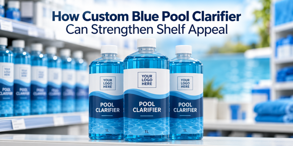
A pool chemical shelf can be a busy place. Bottles stand shoulder to shoulder, each promising cleaner, clearer, or easier-to-maintain water. For a buyer who’s scanning the aisle, many products can look much the same.
So, what makes one bottle worth a closer look?
A clear product name helps. So does a well-designed label. A custom blue pool clarifier can add another useful element: a distinctive liquid appearance that works with the brand’s packaging.
That blue shade may help a product catch the eye, support a coordinated pool care range, and give retailers a more recognizable item to display. Yet color alone won’t build a lasting brand. The formula, directions, packaging, and customer experience must support the first impression.
For pool chemical brands, importers, and distributors, the opportunity is to bring these parts together. A blue clarifier should look appealing on the shelf and deliver the performance described on its label.
Here’s how to approach that balance.
Why First Impressions Matter on a Pool Chemical Shelf?
A customer may walk into a pool shop knowing exactly which product they need. They may also arrive with a photo of cloudy water and no clear idea where to start.
Your packaging needs to help both buyers.
The returning customer should recognize the bottle quickly. The new customer should understand its purpose without having to study every line.
Research on packaging color discusses its role in attracting attention and shaping how consumers perceive products. That supports treating color as part of the design process, though it doesn’t establish that a particular blue shade will increase pool clarifier sales. Wiley Online Library
For your brand, the practical question is straightforward: does the finished package make the product easier to notice and understand?
A distinctive liquid shade may help. But if the front label is crowded, the product name is small, or the bottle looks out of place in your range, that opportunity can fade.
Shelf appeal comes from the complete package.
What “Custom Blue Pool Clarifier” Really Means?
A custom blue pool clarifier is a clarifier formulation with a specified blue appearance, developed within the limits of a suitable colorant and the finished product’s requirements.
Customization may involve the shade, its intensity, the container, or the label design. These decisions should be considered together.
A pale blue liquid in a clear bottle can create a restrained appearance. A stronger blue may provide more contrast against a white label. Inside an opaque white container, however, neither shade will be visible until the bottle is opened.
That distinction matters. If your main sales pack hides the liquid, changing its color may contribute little to shelf appeal.
Eautrix lists a polymer pool clarifier based on 10% PolyDADMAC, CAS 26062-79-3, with original or dyed-blue appearance choices. Its product page also lists custom labels, container choices, and retail-ready packaging support. These provide a starting point for a private label development discussion.
You can explore the Polymer Pool Clarifier specifications before deciding which appearance suits your market.
Blue Can Support a Familiar Pool Care Look
Blue is an understandable design choice for a product associated with swimming pools. It can echo the water imagery already used across labels, displays, and product pages.
That makes it a useful creative starting point.
Imagine a transparent bottle filled with blue liquid, carrying a white label and a dark, easy-to-read product name. The liquid becomes part of the visual design. It adds depth without requiring more printed graphics.
Still, blue won’t communicate the same message to every buyer. Some customers may find a light shade fresh and simple. Others may prefer the stronger appearance of a deeper blue. A professional distributor may care far more about the specification and cost per treatment.
Treat these responses as things to test.
Show actual samples to the people who will sell and use the product. Their reactions are more valuable than a design team’s guess about what “premium” should look like.
The Color Should Never Become the Performance Claim
This is where brand messaging needs care.
A darker blue clarifier does not, by itself, contain more active polymer. Nor does a striking bottle prove that a product works faster or treats more water.
Clarifier performance depends on the formulation and its use under suitable conditions. The liquid’s appearance is a separate product characteristic.
For buyers, that distinction should remain clear throughout the label, website, and sales presentation.
Avoid messages that suggest:
- A deeper blue means greater strength.
- A pale shade means a weaker formula.
- The product works by coloring pool water.
- A visual match guarantees equivalent performance.
Instead, explain the product’s purpose in plain language. Where supported by testing, describe its role in helping filtration remove fine suspended particles.
The blue appearance can support recognition. The performance claim needs its own evidence.
That’s a stronger position for a brand to take, especially when selling through dealers who must answer customers’ questions face to face.
Let the Bottle Help You Choose the Shade
It’s tempting to approve a color from a small sample vial. Resist that temptation.
The same liquid may look different in a narrow bottle, a wide container, or a larger jerrycan. The amount of liquid viewed through the container changes its apparent depth of color.
The container itself also affects the result.
A clear wall lets the liquid contribute directly to the design. A translucent wall softens the view. An opaque wall hides it.
Label coverage adds another variable. A broad front label may leave only a small window of liquid visible. A wraparound label may cover almost everything.
Before approving a custom blue shade, review it in the intended sales container with the proposed label fitted.
Look at the bottle:
- From the front and side.
- Against light and dark backgrounds.
- Under shop lighting and daylight.
- Beside other products in your range.
- From the distance at which a customer would see a shelf.
A color should earn its place in the finished pack, rather than look attractive only in a laboratory sample.
Give the Label a Clear Job
A good-looking blue liquid can draw attention. The label must explain what the customer is looking at.
“Pool Clarifier” should be easy to find and read. A brand name, decorative wave, or background image should support that message rather than crowd it out.
Think of the front label as the start of a short conversation.
First, the buyer needs to identify the product. Then they need to understand its purpose. Next, they may want to check suitability, directions, and pack size.
A sensible reading order might be:
- Brand name.
- Product name.
- A short, supported benefit statement.
- Pack size.
- A clear route to directions and further information.
Use strong contrast. Dark blue text against a similarly dark blue liquid may disappear through a transparent label. Fine white lettering can also become difficult to read over reflections.
Print a physical proof. Put it on a filled bottle. Hold it at arm’s length.
If the product name takes effort to read, simplify the design.
Make the Product Recognizable Within Your Range
A clarifier rarely sits alone in a brand portfolio. It may be sold alongside an algaecide, a pH adjustment product, and other pool maintenance chemicals.
A custom blue appearance can help the clarifier fit into that family.
Consistent typography, logo placement, and label structure can make the range feel organized. Each product should also remain easy to distinguish.
That second point deserves attention. If every bottle carries the same blue wave, the same cap, and nearly identical wording, customers may pick up the wrong item.
Give each product a clear name and a distinct visual cue. Color can support that cue, but it should never be the sole identifier.
A useful test is to line up the whole range and ask someone unfamiliar with it to find the clarifier. If they hesitate, the design may need a stronger product name or a clearer layout.
A coordinated range should make shopping easier.
A Recognizable Shade Needs Consistent Production
Suppose a retailer receives one shipment in a light aqua shade. The next arrives much darker.
Even if the products perform alike, the difference may prompt questions. Has the formula changed? Is one shipment old? Did the wrong product arrive?
A defined appearance specification can help reduce that uncertainty.
Rather than ordering “blue,” agree on an approved reference sample and a practical acceptance method. Where suitable, instrumental color measurements can support visual inspection.
The specification should address the finished product, including:
- The target shade and acceptable variation.
- The agreed viewing conditions.
- The sample container or viewing method.
- The expected liquid clarity.
- Any unacceptable sediment or visible separation.
Color inspection should accompany the other quality checks required for the formulation. It cannot replace them.
For a private label brand, consistency has a quiet commercial value. It helps the next shipment look like the product your customer already knows.
Test the Blue Formula in the Finished Package
An attractive sample is the start of development. It is not proof of long-term suitability.
A proposed colorant needs evaluation in the actual clarifier formulation. Its suitability cannot be assumed from its appearance in water or from use in a different product.
The development work should consider the formula, container, closure, storage conditions, and intended application.
Depending on the product and market, relevant checks may include appearance over time, color retention, visible separation, container staining, closure performance, and treatment performance.
The finished blue version also needs assessment at its intended use level. Any potential for unwanted water coloration, staining, or deposits should be investigated rather than dismissed.
Be precise about what has been demonstrated.
A short storage trial does not prove a full shelf life. A pleasing fresh sample does not establish compatibility with every pool finish or filter system.
The goal is to build an appearance choice that the brand can supply and describe with confidence.
Use Shelf Appeal to Help Retailers Sell Clearly
Retailers need products they can display and explain.
A recognizable clarifier can support a neat shelf arrangement, a seasonal pool-opening display, or a small group of related maintenance products. But the display still needs to answer the shopper’s question: “What is this for?”
Keep supporting copy simple.
If the label describes the product as helping with fine suspended particles, the shelf card should carry the same message. Avoid turning a modest, supported claim into a sweeping promise on a display board.
The packaging should also suit the shelf itself. Consider the bottle’s height, footprint, front-facing area, and ease of handling.
An unusual bottle may look impressive in a photograph yet fit poorly into the retailer’s existing space.
Ask dealers for feedback before committing to a large packaging order. They can often spot practical issues that are easy to miss on a design screen.
Online Shelf Appeal Counts, Too
For online buyers, the product image is often the first close view of the pack.
Your blue clarifier needs to look clear and credible in a small image, not just in a full-size photograph.
Check whether the product name remains readable when the image is reduced to a typical listing thumbnail. If the label becomes a blur, a more dramatic liquid color won’t solve the problem.
Use consistent lighting and a neutral background for primary product photos. Supplement those with images that show the cap, back label, pack size, and carton where useful.
Keep the liquid color realistic.
Heavy editing can create a vivid shade that production bottles cannot match. That gap may disappoint customers and complicate approval discussions with distributors.
Concept images are useful during development, but they should be identified as concepts. Once the pack is finalized, use photographs of the approved product for sales listings.
Choose Pack Sizes for the People Buying Them
A retail bottle and a professional refill container serve different needs.
A smaller pack may suit a pool shop shelf, where easy handling and readable directions matter. A larger jerrycan may be intended for service teams who value pouring control, storage efficiency, and treatment cost.
The same branding can connect these packs, but the design does not have to be identical.
For example, a transparent retail bottle may show the custom blue liquid. A larger opaque pack may rely on a blue label panel and clear product identification.
In that case, the liquid color is only one part of the brand experience.
Discuss the whole system with your supplier: bottle material, closure, label, carton, transport requirements, and filling method.
A package that looks appealing but leaks or becomes difficult to pour will soon lose its charm. Practical details are part of shelf appeal because they influence whether buyers trust the product enough to purchase it again.
Find Out Whether Your Design Actually Helps
You don’t need to launch a large order to learn whether a design communicates well.
Start with a small set of finished mockups. Keep the formula and pack size consistent so that the design choices are easier to compare.
You might compare a light blue and a deeper blue in the same bottle, or compare a clear bottle with your usual white container.
Ask potential buyers specific questions:
- Which product name can you read first?
- What do you think this product does?
- Which pack fits the rest of this range?
- Does anything about the design cause confusion?
- Which bottle would be easiest to display?
Avoid asking only, “Which looks best?” An attractive design may still communicate the wrong purpose.
If you later run a sales trial, record the conditions. Price, placement, promotions, and stock availability can all affect results. A stronger sales week alone cannot prove that the shade caused the improvement.
Build a Useful Brief for Your Supplier
A clear brief makes custom blue pool clarifier development easier.
Start with the audience and sales channel. A pool service distributor may need a different presentation from a retailer serving home pool owners.
Then describe the intended formula, appearance, packaging, and performance requirements.
Include a physical color reference where possible. A phone photo can help explain an idea, but screen settings and lighting make it a poor final approval standard.
Your brief should also identify the intended market, required documents, sample quantity, and approval steps.
Ask the supplier to distinguish between what is already available and what needs development or testing. That helps both sides discuss costs, timing, and order quantities with fewer assumptions.
Approve the formula, shade, container, and label as a complete product before approving production.
A well-written brief is less glamorous than a finished label. It is also one of the most useful tools in the project.
Give Buyers a Reason to Pick It Up—and Come Back
Custom blue pool clarifier can strengthen shelf appeal when the liquid color works with the bottle, label, and wider brand range.
The strongest presentation is easy to recognize and easy to understand. It gives customers a clear idea of the product’s role without suggesting that blue color proves greater treatment strength.
For a private label brand, that creates a sound starting point: a distinctive appearance, a controlled specification, and messaging supported by the finished product.
Before your next launch, review the current bottle from the buyer’s position. Is the product name clear? Does the shade suit the pack? Can your supplier reproduce it? Do the directions help customers use it correctly?
Those questions turn an attractive idea into a product worth putting on the shelf.
Frequently Asked Questions
1. Does custom blue pool clarifier work better than a clear version?
Blue color alone does not establish better performance. Compare the finished formulations through suitable testing, including their active polymer specifications and results under the intended application conditions.
2. Can I match private label pool clarifier to my brand’s blue color?
A supplier may be able to develop a close match, subject to colorant suitability and stability testing. Approve the shade in the intended bottle, since container shape and material affect its appearance.
3. Is a transparent bottle best for blue pool clarifier shelf appeal?
A transparent bottle makes the liquid visible, which can support the design. However, container compatibility, storage requirements, closure quality, and transport performance must also guide the packaging choice.
4. Does a darker blue pool clarifier contain more active ingredient?
No. Color intensity is not a reliable measure of active polymer content. Buyers should use the product specification, supporting quality documents, and treatment directions to assess the formulation.
5. What should I approve before ordering custom blue pool clarifier?
Approve the finished formula, physical shade reference, appearance limits, container, closure, label, and carton. Confirm the required performance and stability evidence, documentation, and production acceptance checks before placing the order.